Totally Gluten Free Bakery
A bakery where every single item is totally gluten free owned by Wendy and Lori. There has been various projects that WDS has worked with at the bakery from product photography to digital displays.
A bakery where every single item is totally gluten free owned by Wendy and Lori. There has been various projects that WDS has worked with at the bakery from product photography to digital displays.
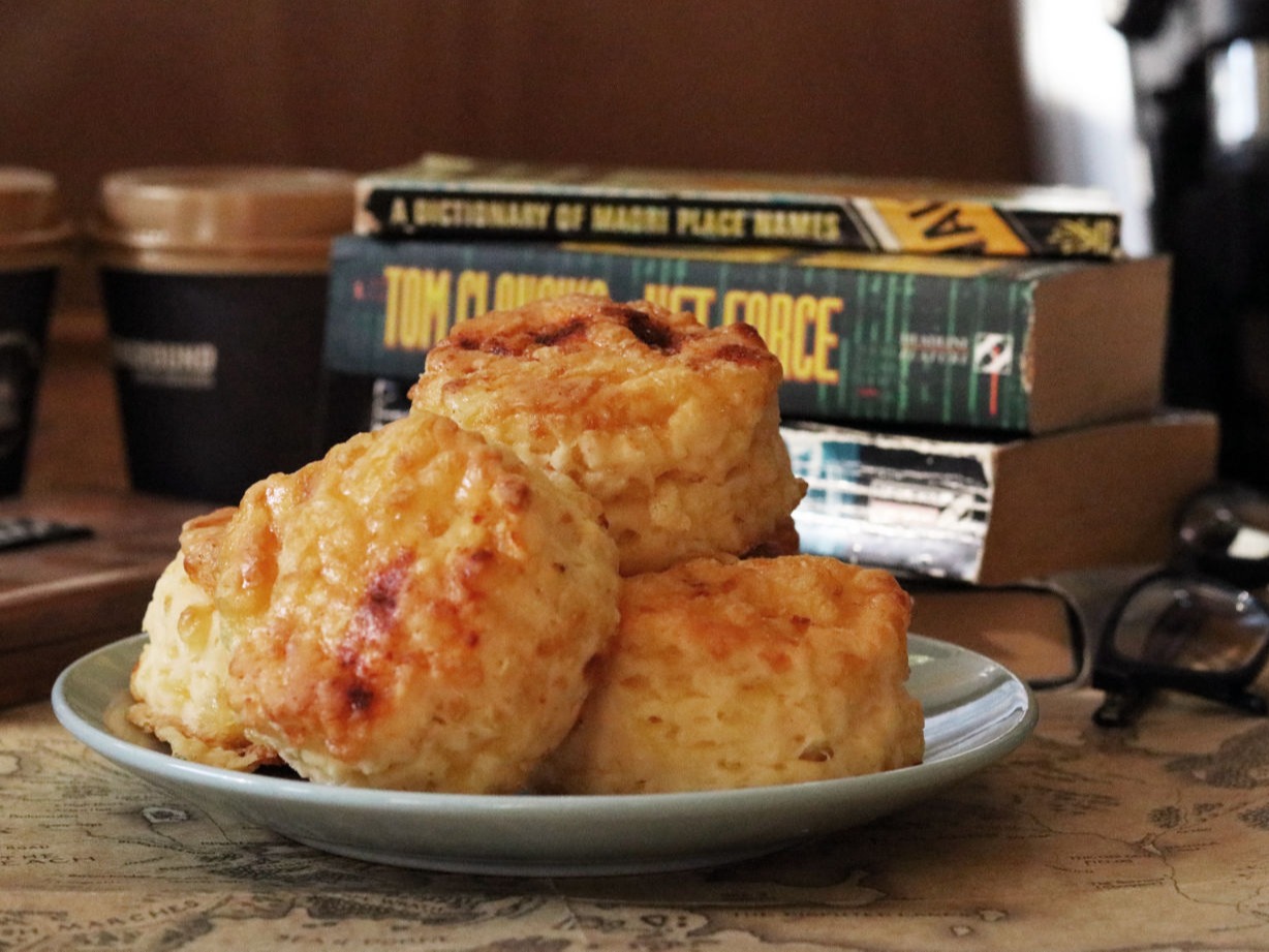
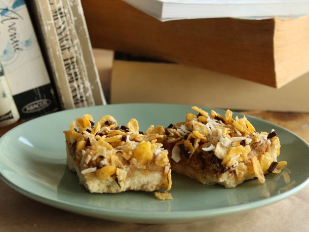
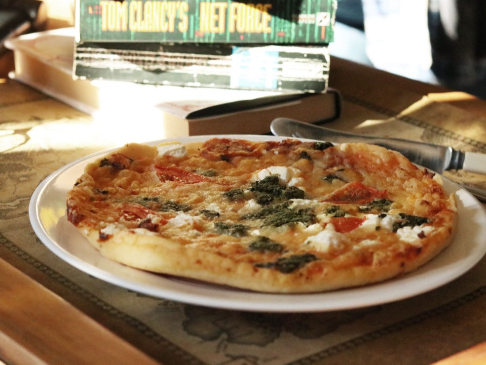
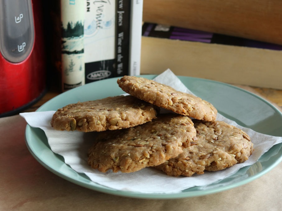
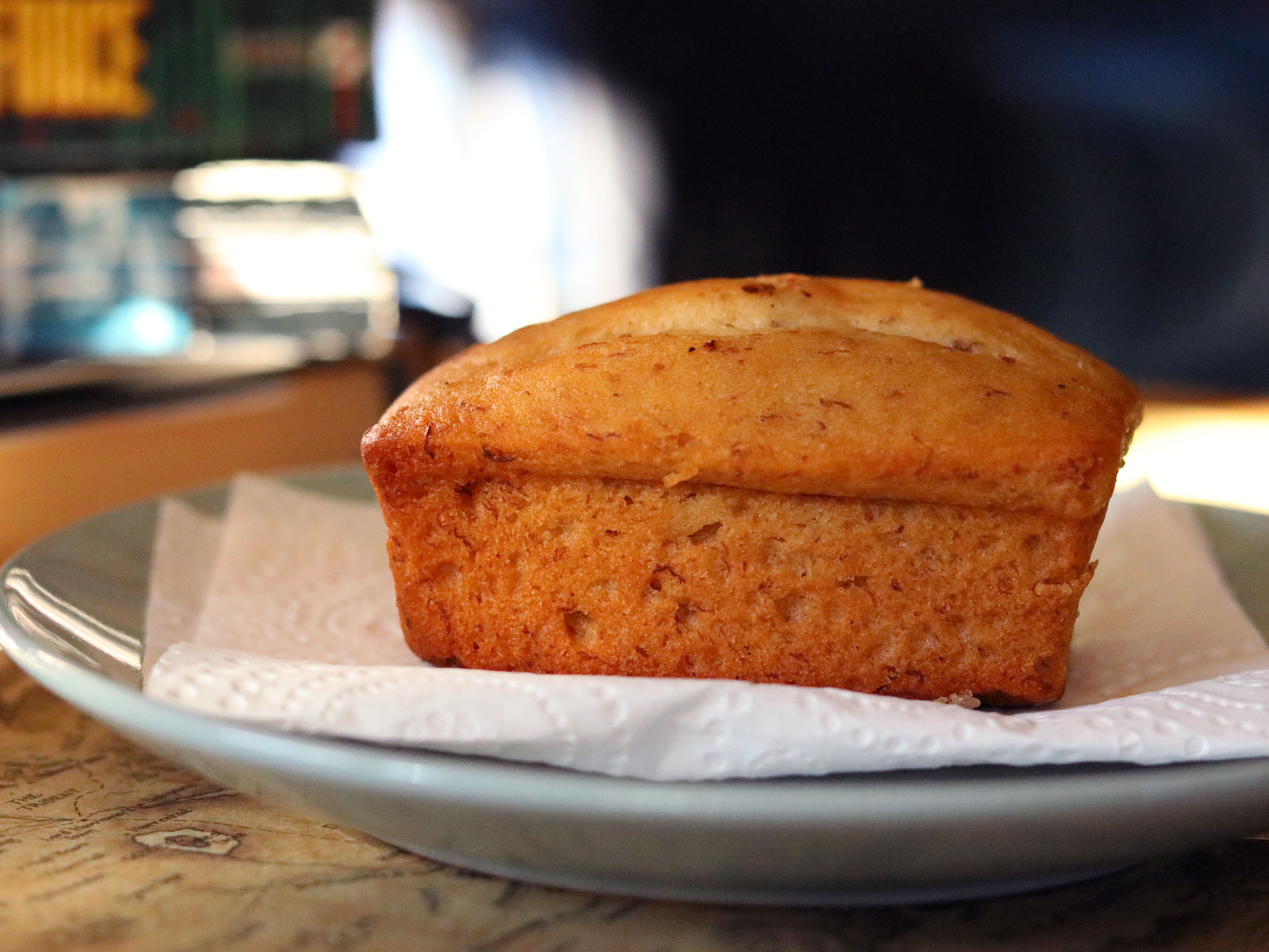
A majority of online sales for the baked goods are done through the website and needed to have a good quality image for the online catalogue.
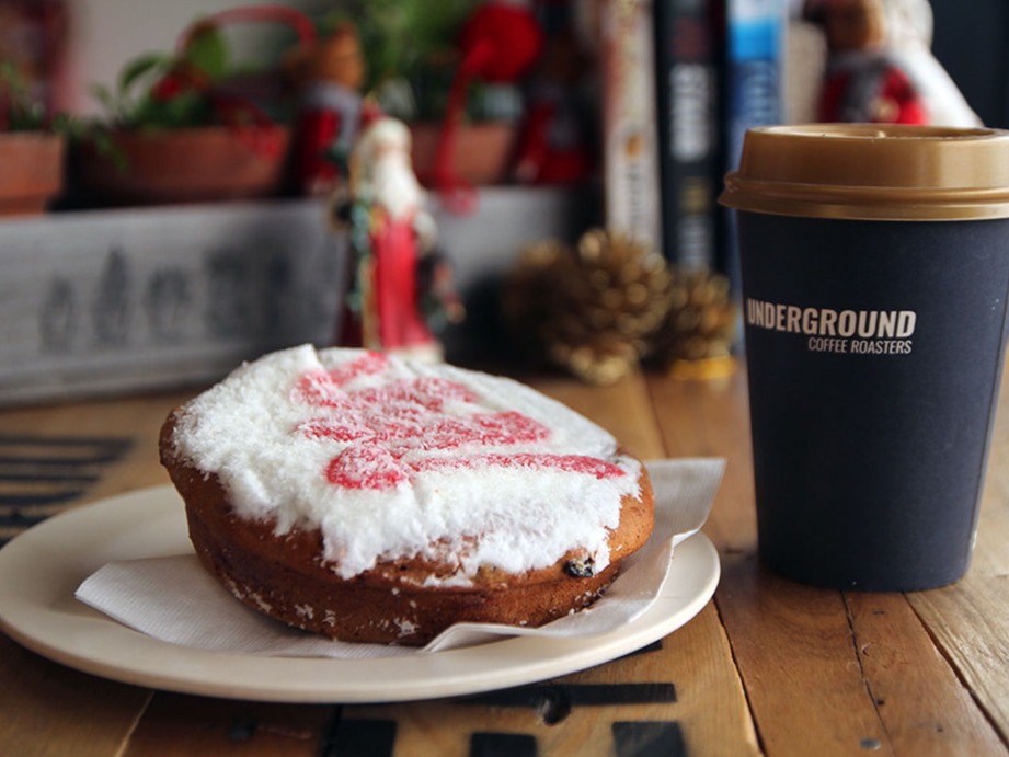
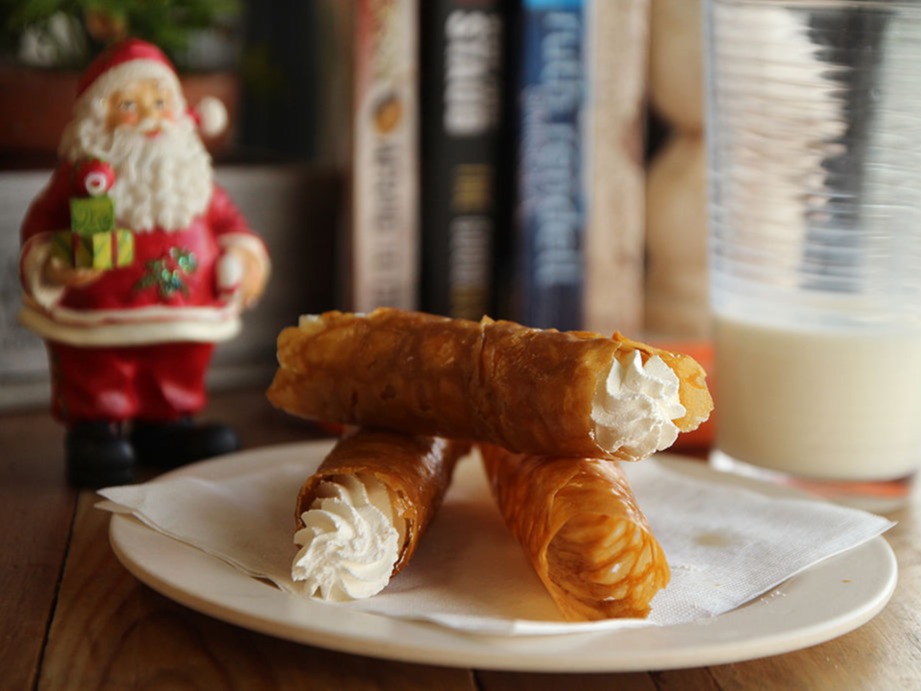
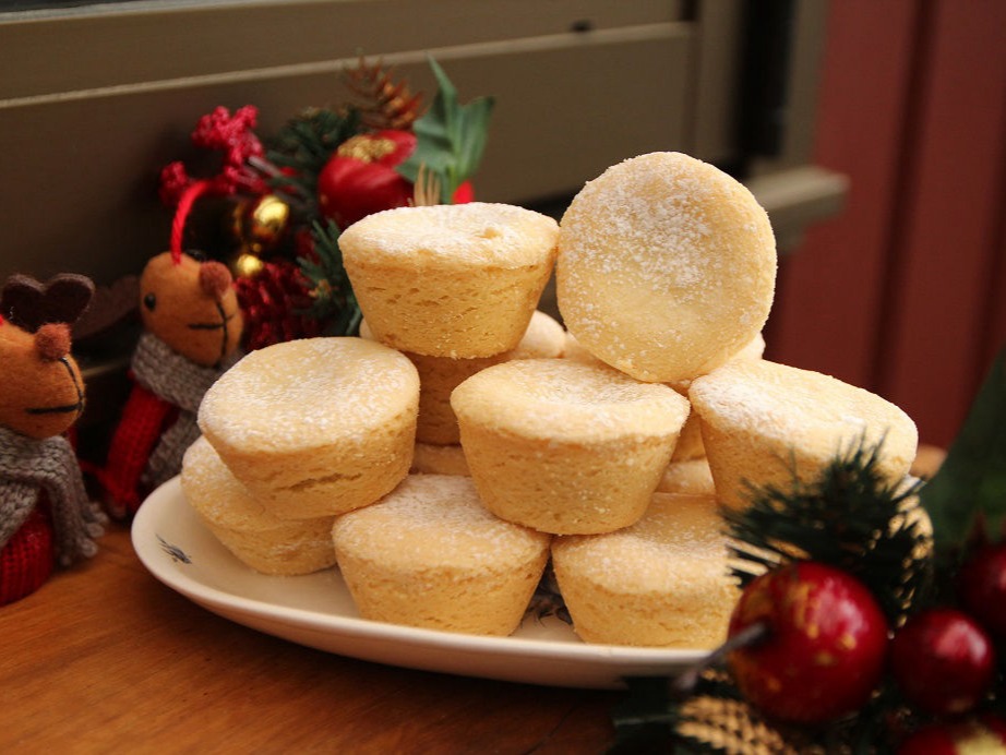
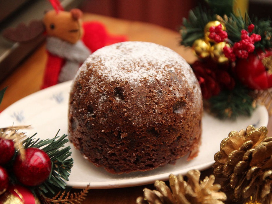
Previously the images used were products only but food is quite hard to seem appealing when it's "just another food item". Discussions were had about the preferred scene, colours and props that would suit the business and I went with a combination that was attractive and complementary colours together. Using colours in the props when the products lacked them. Events such as Christmas and Easter have helped with the props as well to make seasonally appropriate images.
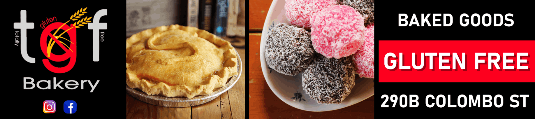
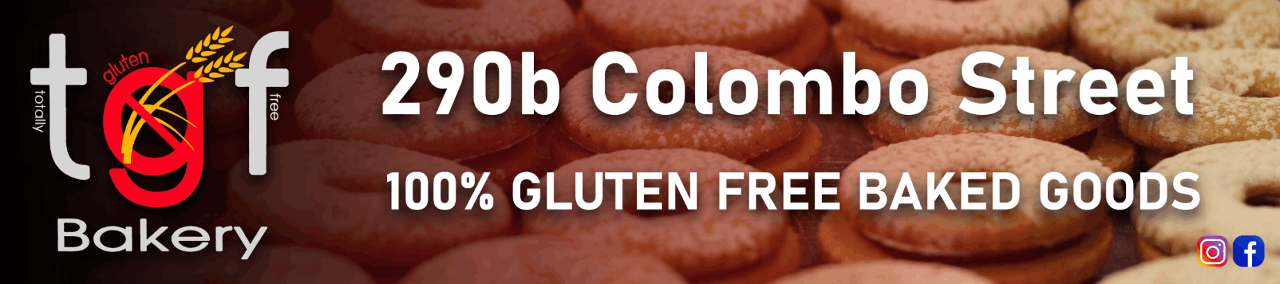
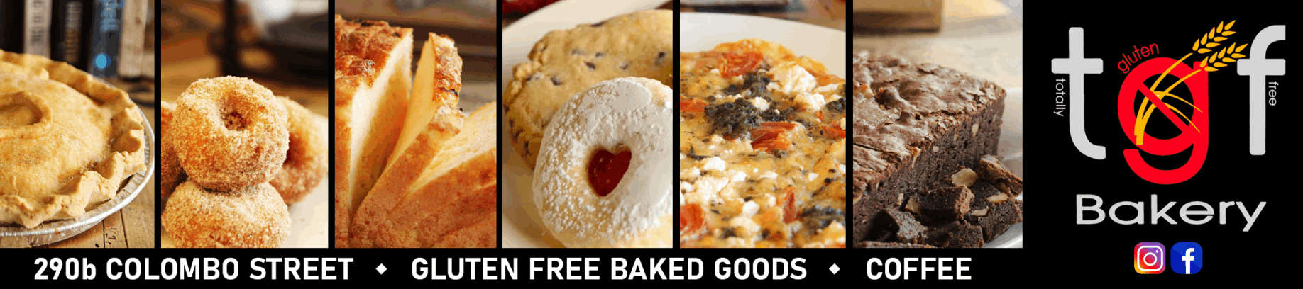
These photos have been used on various social medias such as Facebook and Instagram, the website for online ordering, the Metropol magazine and digital billboards around Christchurch.
An opportunity to use a digital billboard in Spreydon, Christchurch came up to advertise information about the business. The business owners were wanting to let people know the location of the bakery as it has had to move to different locations through the Christchurch Earthquakes.
As the billboards are viewable from the road, the best method of sending a message is with the theme of "less is more". Too many words are distracting from the road to try and soak in. White is also a big no-no for dominating the display as well.
Utilizing the images above to put across the homely baking which involved a range of colours and drag your attention to the board then adding the logo with the social medias to direct to the online presence and finally basic keywords describing the business and the address in the simplest way.
Option 1
Option 2
Option 3

Made with
Landing Page Software